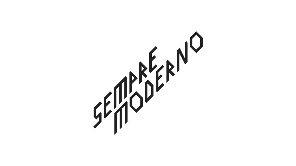
Sempre Moderno
Create a logo for a series of events on modern architecture
Year:
2024
Client:
Ordine degli Architetti di Milano
Area:
Architecture
Services:
Logo design
Designer:
E Bonetti, L Bontempi, C Dellavalle
The Fondazione dell’Ordine degli Architetti of Milano commissioned to Parco Studio to create a graphic symbol to accompany the communication for a series of events and conferences on modern architecture in Milan, titled u0022The delicate renewal of Modern architecture in Milan – balancing preservation, the need for updates, entrepreneurial ambitions, regulatory constraints, and sustainability.u0022
Parco Studio designed a logo by focusing on typographic details of the chosen font, particularly its terminals. These terminals feature sharp cuts, and the letter u0022Ou0022 adopts the shape of a rhombus, a prominent architectural element in Milanese architecture, instantly recognizable to architecture enthusiasts.
As an additional typographic feature, a balance between positive and negative space was crafted to ensure a consistent amount of black between the glyphs. The logo is designed to stand alone on white, black, or red backgrounds (from the Order’s palette) as a placeholder on the website for presenting events, or it can be overlaid on images, such as for social media. The diagonal design echoes the upward growth that characterized much of the architecture from that period.

Drawing inspiration from modern Milanese architecture, with its strong connection to the local area and its integration with specific details of the modernist architectural movement, the custom font is a sans serif with subtle features that make it unique.